
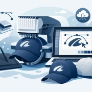
How to Digitize Logos for Caps Right
Cap jobs expose weak digitizing fast. A logo that runs clean on a flat left chest can break down on a curved cap front, especially when the artwork has small text, thin outlines, or stacked detail. If you are figuring out how to digitize logos for caps, the real goal is not just converting art into stitches. It is building a file that sews clean, holds shape, and stays production-friendly under real shop conditions.
For embroidery businesses and apparel decorators, that difference matters. Caps move fast, margins can be tight, and machine time gets expensive when a design needs repeated edits. Good cap digitizing reduces thread breaks, registration issues, distortion, and wasted blanks. It also helps you quote more confidently because you know the file is built for the product, not just for the screen.
How to digitize logos for caps starts with the cap itself
The first mistake is treating every cap the same. Structured trucker caps, low-profile cotton caps, performance caps, and unstructured styles all react differently under the needle. The front panel height, seam placement, crown firmness, and fabric surface all affect how the design should be digitized.
A structured cap gives you more support, but the center seam can still interfere with fine detail. An unstructured cap may not hold dense stitching as well, especially if the design has broad fills or sharp vertical elements. If the logo crosses the seam, pull and push compensation need more attention, and sequencing becomes more important.
That is why experienced digitizers ask about cap style before they build the file. The best result depends on the blank, not just the logo.
Clean artwork makes cap digitizing easier
Cap embroidery is not the place to force a low-quality JPG into production. If the source art is blurry, compressed, or inconsistent, the digitizing process slows down and the result usually suffers. Before any stitch planning starts, the artwork needs to be reviewed for shape clarity, spacing, and scale.
Logos with tiny taglines, hairline borders, distressed effects, gradients, or overlapping shadows often need simplification. That is not a compromise. It is production discipline. A cap front has limited embroidery space, and the curve of the panel makes small details even less reliable.
In many cases, the best path is to redraw or vectorize the logo first, then digitize from clean linework. That gives the digitizer accurate edges and better control over stitch direction, underlay, and density.
Size and placement change everything
A cap logo is usually not digitized at the same size logic as a left chest design. The front embroidery area is wide enough for strong branding, but not wide enough for unlimited detail. Most production issues begin when the logo is scaled down without adjusting stitch types, pathing, or spacing.
When sizing a cap design, you need to think beyond width and height. You need to think about readability from a normal viewing distance, how the design sits above the bill, and whether the shape works with the crown curve. A design that is technically within the embroidery area can still sew poorly if the elements are too dense or too close together.
This is where practical edits matter. Text may need to be enlarged. Thin gaps may need to be opened. A border might need to be thickened or removed. If the client wants the exact original art, the answer is not always yes. The better answer is often a production-ready version that keeps the brand recognizable while sewing well on caps.
Stitch type selection matters more on caps
Digitizing for caps is not just about tracing shapes. Stitch choice controls how the logo behaves on a curved surface. Satin stitches usually work well for columns, lettering, and bold outlines, but only within workable width limits. If a satin gets too wide, it can snag, loop, or lose consistency. If it gets too narrow, it may not hold enough coverage.
Fill stitches are often needed for larger areas, but they can create bulk fast on a cap front. Density has to be balanced carefully, especially over seams or on stiffer crowns. Too much fill can cause puckering, poor registration, and a heavy finished cap that looks overworked.
Running stitches are useful for detail and travel paths, but small decorative runs can disappear or sink into textured fabric. On caps, every stitch type has a trade-off. The right mix depends on the logo structure, fabric, and production speed you need.
The center seam is the problem you cannot ignore
If the logo is centered on the cap, the center seam becomes a technical issue from the start. It creates uneven height and resistance under the needle, and that can throw off fine details that would otherwise sew cleanly on flat goods.
Strong cap digitizing accounts for that seam with smart sequencing, compensation, and underlay choices. Wider satin elements often perform better than delicate detail over the seam. Symmetry also has to be handled carefully. A design may look mathematically balanced on screen but sew unevenly if both sides are not built to support the seam properly.
This is one reason cap files should be digitized specifically for caps, not converted from a flat embroidery file and sent straight to the machine. A left chest file can be a starting point, but it is rarely the final answer.
Pathing and sequence decide whether the file runs clean
A cap design can look great in software and still run badly on the machine. That usually comes down to pathing. Poor sequence creates unnecessary trims, weak registration, jump stitches, and unstable sewing order. On caps, those issues show up quickly because the garment is less forgiving than a flat panel.
Good pathing supports the natural flow of the design. It keeps the structure stable as the logo builds out, minimizes movement, and avoids sewing detail over unstable areas too early. Underlay has a major role here as well. It supports coverage and edge definition, but too much underlay can add bulk. Too little and the top stitching loses clarity.
Efficient sequencing also helps shops move faster. A cap file that runs with fewer stops and fewer corrections saves labor and protects your delivery schedule.
Testing is part of how to digitize logos for caps professionally
No serious production team assumes a cap file is perfect because it looks right in digitizing software. A test sew tells the truth. It shows whether the lettering holds, whether the fill coverage is balanced, and whether the seam causes distortion in the critical parts of the logo.
This is where many shops lose time. They skip the sample, then end up making edits after a failed production run. A better process is to sew a sample on a cap that matches the actual order as closely as possible. The thread, needle, backing, cap frame setup, and machine speed all influence the result.
If the logo needs adjustment, the changes should be made with production in mind. Sometimes that means increasing pull compensation. Sometimes it means changing stitch angle, reducing density, or simplifying small elements. The right edit depends on what the sample reveals.
When to outsource cap digitizing
For many shops, cap digitizing is where outsourcing starts to make the most financial sense. Caps are technically demanding, client-facing, and often deadline-sensitive. If your in-house team is stretched or your digitizing skill set is stronger on flats than headwear, outsourcing can protect both quality and turnaround.
A specialized digitizing partner can usually spot production risks before the file reaches your machine. That means fewer revisions, more predictable sew-outs, and less disruption on rush jobs. It also helps when pricing is flat and turnaround is fast, because you can plan jobs without guesswork.
UltraEMB works with embroidery businesses that need that kind of support every day – especially on cap designs that require clean execution, fast delivery, and consistent quality across repeat orders.
What a production-ready cap file should deliver
A good cap embroidery file is not judged by how complex it looks on screen. It is judged by whether it runs efficiently, reads clearly, and holds up across real production. That includes clean lettering, stable coverage, controlled stitch count, and logic that fits the cap style being used.
If a logo needs to be simplified to perform better, that is often the right call. If a design needs a separate version for caps instead of reusing the left chest file, that is also the right call. The best digitizing decisions are not about preserving every pixel of the original artwork. They are about preserving brand impact where the needle actually meets the cap.
When you approach cap digitizing that way, you get more than a file. You get fewer problems on the machine, better-looking finished goods, and a production process that is easier to trust when the deadline is close.


 designs@ultraemb.com