
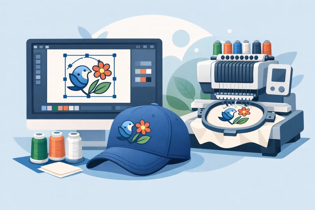
How to Prepare Artwork for Embroidery
A logo can look sharp on screen and still fail on a machine within minutes. That usually happens long before production starts. If you want to know how to prepare artwork for embroidery, the real job is not just sending a file – it is sending artwork that can be translated into clean stitches, stable runs, and a finished product that matches the customer’s expectations.
For embroidery shops, apparel decorators, and promo product suppliers, file prep is where production speed and quality start to separate. A well-prepared design reduces revision cycles, avoids push and pull issues, and gives the digitizer a clear path to build a stitch file that runs properly on the intended item. Poor prep does the opposite. It creates guesswork, delays approvals, and often leads to disappointing sew-outs.
What embroidery-ready artwork actually means
Artwork for print and artwork for embroidery are not the same thing. A print file can hold tiny gradients, hairline details, and complex effects because ink behaves differently than thread. Embroidery has physical limits. Thread has thickness, stitches need space, and fabrics shift during sewing.
That is why preparing artwork for embroidery is really about simplification and clarity. The goal is to provide clean source art that shows shape, scale, color breaks, and intended usage. A digitizer still has to convert that art into stitch logic, but strong input saves time and improves accuracy.
In practical terms, embroidery-ready artwork should clearly communicate the design without visual noise. It should be easy to read, easy to size, and realistic for thread.
How to prepare artwork for embroidery before digitizing
The best time to fix embroidery issues is before digitizing starts. If the art is messy, low resolution, or full of effects that thread cannot reproduce, those problems will surface later in production.
Start with the cleanest file available. Vector files are ideal because they preserve sharp edges and make it easier to identify exact shapes and color areas. AI, EPS, PDF, and SVG files are usually the strongest starting point. High-resolution raster files can still work, but they need to be clear enough for accurate interpretation. If a logo arrives as a blurry screenshot, a compressed web image, or a photo taken from a business card, the digitizing process slows down immediately.
Size matters just as much as file quality. Always specify the final embroidery size up front. A left chest logo at 3.5 inches wide requires a very different stitch strategy than the same logo on a jacket back at 10 inches wide. Cap embroidery changes the rules again because the sewing field, center-out sequence, and fabric structure all affect how the design should be built. Without final size and placement, even strong artwork leaves too much open to assumption.
You also need to identify the product type. A logo for polos, caps, towels, patches, and bags cannot be treated as one universal file. Towels need bolder coverage to hold detail over texture. Caps often require simplified shapes and stronger underlay. Patches may allow cleaner edges and more controlled stitch density, depending on the patch style. Good artwork prep includes telling the digitizer exactly where the design will run.
Keep the design clean, not overloaded
One of the most common mistakes in embroidery prep is sending artwork that is technically attractive but structurally too busy. Small text, thin outlines, drop shadows, gradients, distressed textures, and overlapping effects might work in print. In embroidery, they usually need to be reduced, merged, or removed.
If a shape is too small to hold stitches cleanly, it has to be enlarged or eliminated. If text is too fine, it may need a different font treatment or a simplified version for smaller applications. If the logo uses soft fades or tonal transitions, those need to be translated into solid thread areas or a limited number of stitch-based color changes. The cleaner the artwork, the better the sew-out.
This is where experience matters. Not every design element should be preserved exactly as shown on screen. Some should be adjusted for production so the finished embroidery still feels true to the brand. That trade-off is normal. Good prep is not about forcing every visual detail into thread. It is about protecting the most important parts of the design.
Color setup should be precise
Embroidery thread colors are not digital colors. A red in a JPG is only a screen value unless someone defines the intended thread match. If brand accuracy matters, provide color references whenever possible. PMS callouts are helpful. Existing thread charts are even better if the job needs to match a known supplier standard.
At the same time, keep color count realistic. More colors can increase complexity, trim count, and machine time. That does not mean every design should be reduced aggressively, but it does mean color decisions should support production efficiency. For high-volume apparel programs, simplifying thread changes can make a real difference in throughput.
If the same logo will be used across multiple garment colors, call that out early. A dark logo on a black jacket may need an alternate version with contrast adjustments. White outlines, border changes, or knockouts that are unnecessary on light garments may be essential on dark ones.
Text and detail need special attention
Text is where embroidery problems become obvious fast. Letters that look perfectly readable in a vector proof can close up, wobble, or lose legibility once stitched at small sizes. That is why text should never be treated as a minor detail in file prep.
Before sending artwork, check the smallest lettering in the design and ask a basic production question: will this still read in thread at the actual size? If not, the design may need a simplified small-size version. Many logos benefit from having one embroidery layout for left chest use and another for larger placements where finer detail can be retained.
Thin lines create the same issue. Strokes that are too narrow may disappear or require satin stitches that become unstable. In many cases, wider shapes and stronger separation lines produce a better result than trying to mimic the exact printed artwork.
Include clear production notes with the file
Even strong artwork can lead to weak output if the instructions are vague. The fastest path to a usable digitized file is a clean art file paired with clean production information.
That means noting the final size, placement, garment type, fabric type when relevant, and any customer priorities. If a client cares most about matching a brand icon exactly but is flexible on a tagline, say so. If the order is for structured caps, mention that. If the file will be used for puff embroidery, jacket backs, or towel embroidery, those details should be included from the start.
This is also the right place to flag deadline pressure. A fast turnaround is only useful if the requirements are clear enough to avoid back-and-forth. Shops that prepare artwork properly usually move through production faster because the digitizer can focus on execution rather than interpretation.
Why vector conversion often comes first
Many embroidery orders begin with art that is not ready for digitizing at all. It may be a raster logo copied from a website, an old JPEG from a past customer, or a low-quality file pulled from email history. In these cases, vector conversion is often the first step toward proper embroidery preparation.
Clean vector art gives production teams a much better foundation. It clarifies edges, separates objects, and removes the ambiguity that slows down digitizing. For businesses handling repeat orders, it also creates a reusable asset that can support embroidery, screen printing, signage, and promotional graphics without rebuilding the art each time.
That matters commercially. Better files mean fewer delays, more predictable output, and less wasted time inside the shop. For many decorators, outsourcing both vector conversion and digitizing is simply more efficient than trying to patch low-quality art in-house.
The goal is not just a file – it is a better sew-out
When people ask how to prepare artwork for embroidery, they are usually thinking about file formats. That is part of it, but only part. The bigger issue is whether the artwork gives the digitizer what they need to build a design that will run cleanly on the actual product.
Good prep means clear art, realistic detail, defined size, accurate colors, and usable production notes. It also means accepting that embroidery has rules. Thread needs space. Fabric moves. Small decisions in the art stage affect machine performance later.
For busy shops and growing apparel businesses, that is why artwork preparation should be treated like production planning, not admin work. When the file is right at the start, everything after it gets easier, faster, and more profitable. If you are working against deadlines and need dependable execution, UltraEMB can help turn rough artwork into production-ready files without slowing your workflow down.
The best embroidery jobs usually look simple from the outside. That is because the hard part was handled before the machine ever started.
 designs@ultraemb.com
Leave a Reply
Want to join the discussion?Feel free to contribute!